


A gift for you!
Sign in for our newsletter
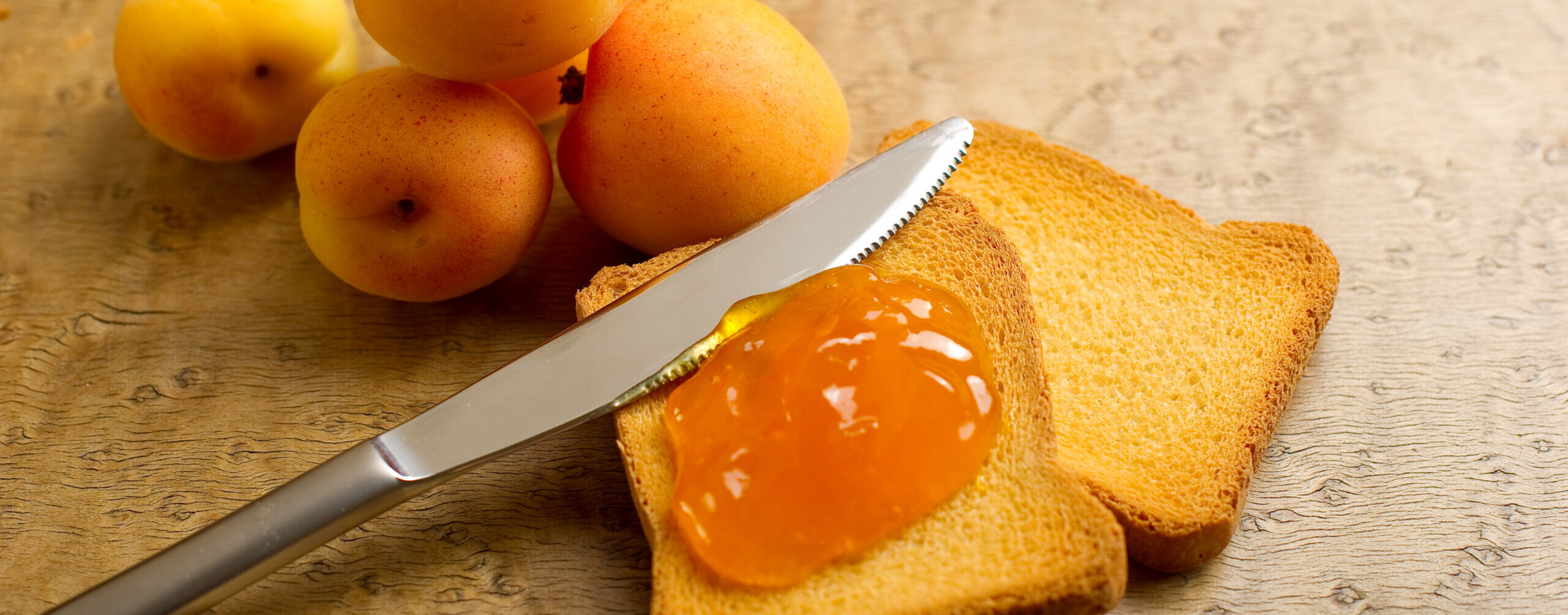
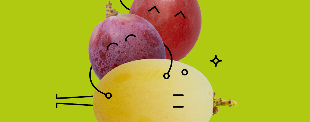
The Apulian company renews its image by highlighting the products that most distinguish it: apricots, cherries, grapes and citruses.
The four seasons of fruit: this is the payoff for the new logo of the Giacovelli company in Locorotondo, Apulia. The company has just presented on social media the restyling of its brand and, in general, of its image, focusing on the products that most represent it: apricots, cherries, table grapes and citruses.
The message is clear. Today, there is a need to communicate dynamism and constant attention to innovation, to be seen to be in step with the times, in the vanguard. All this, however, without denying the Apulian company’s long history and bond with its territory and traditions. Respecting the seasons and supplying the entire production (in particular apricots, cherries, grapes and citrus fruits) while maintaining the same high quality standards that have always distinguished it.
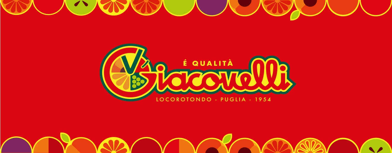
The same typical Giacovelli colors, red, green and yellow, and the same V as Vito (the father of the owners, Pietro and Raffaele, e.d.) remain in the logo. In short, the guidelines are the same, but enhanced. The graphics will then be declined as the seasons of the individual excellencies alternate.
The new coordinated image will be used in all modes of external communication: from packaging to labels, from information materials to the website and social channels, without neglecting in-store initiatives. First releases of the new look in these sunny mid-May days, as the cherry campaign gets into full swing.